Every squeeze across 600+ stocks and ETFs, ranked on one board.
The Squeeze Board scans 600+ stocks and ETFs across 12 timeframes and lays out every active compression on one matrix, ranked by the backtest edge on each name, how many timeframes are squeezing together, and the trend. You read a short list, not raw dots.
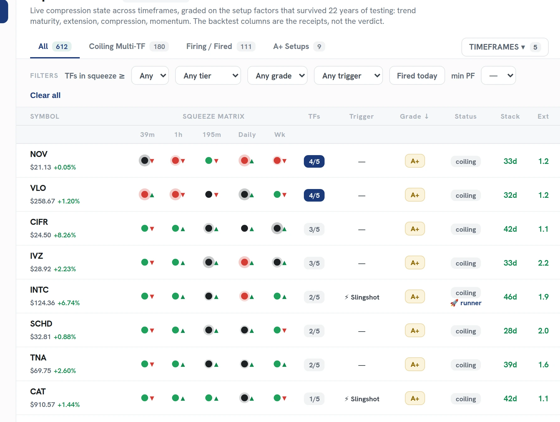
From 6,000+ cells to the few that matter.
600+ symbols times 12 timeframes is too much to watch by hand. The board reads all of it continuously and surfaces the setups worth a second look.
Squeeze state per cell
Each symbol-timeframe cell shows whether a squeeze is on, how tight it is, and how long it has been building.
The 22-year record per name
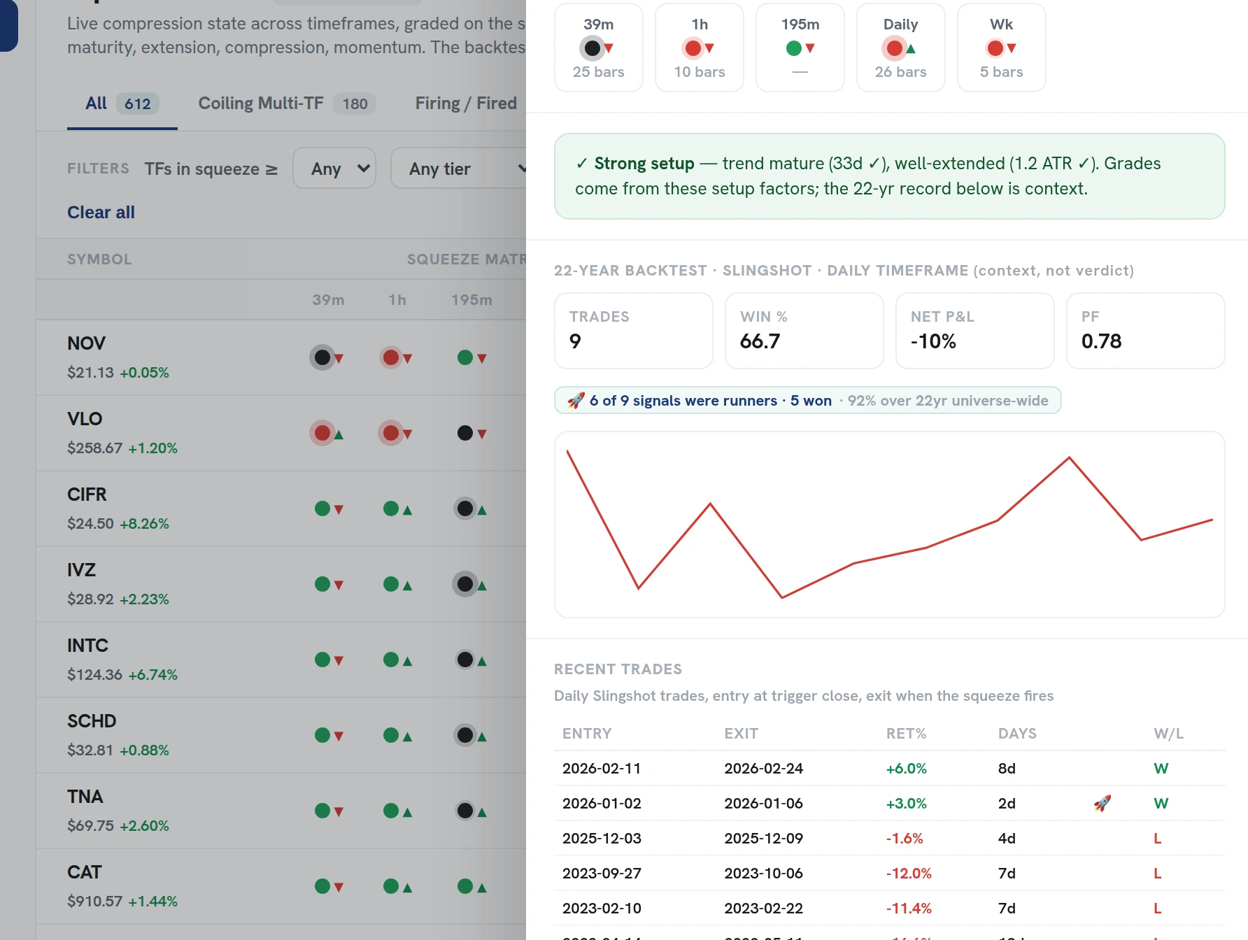
Every symbol carries its own squeeze backtest, so equal-looking compressions stop looking equal. The board ranks the ones that have actually paid.
Closest to firing first
The board sorts by how close each squeeze is to releasing, so the timeliest setups sit at the top. Descriptive, not a prediction.
Releases flagged live
When a squeeze fires, the cell flips and glows. Fired means the move is releasing, which is exit territory, not an invitation to chase.
Every setup reads itself, right on the board.
Click any squeeze and you get the three signals in plain language: the 22-year backtest edge on that name, how many timeframes are squeezing together, and whether the trend is stacked behind it.
The full per-symbol record is one click away. It is the receipts behind the rank, never a promise on the next trade.
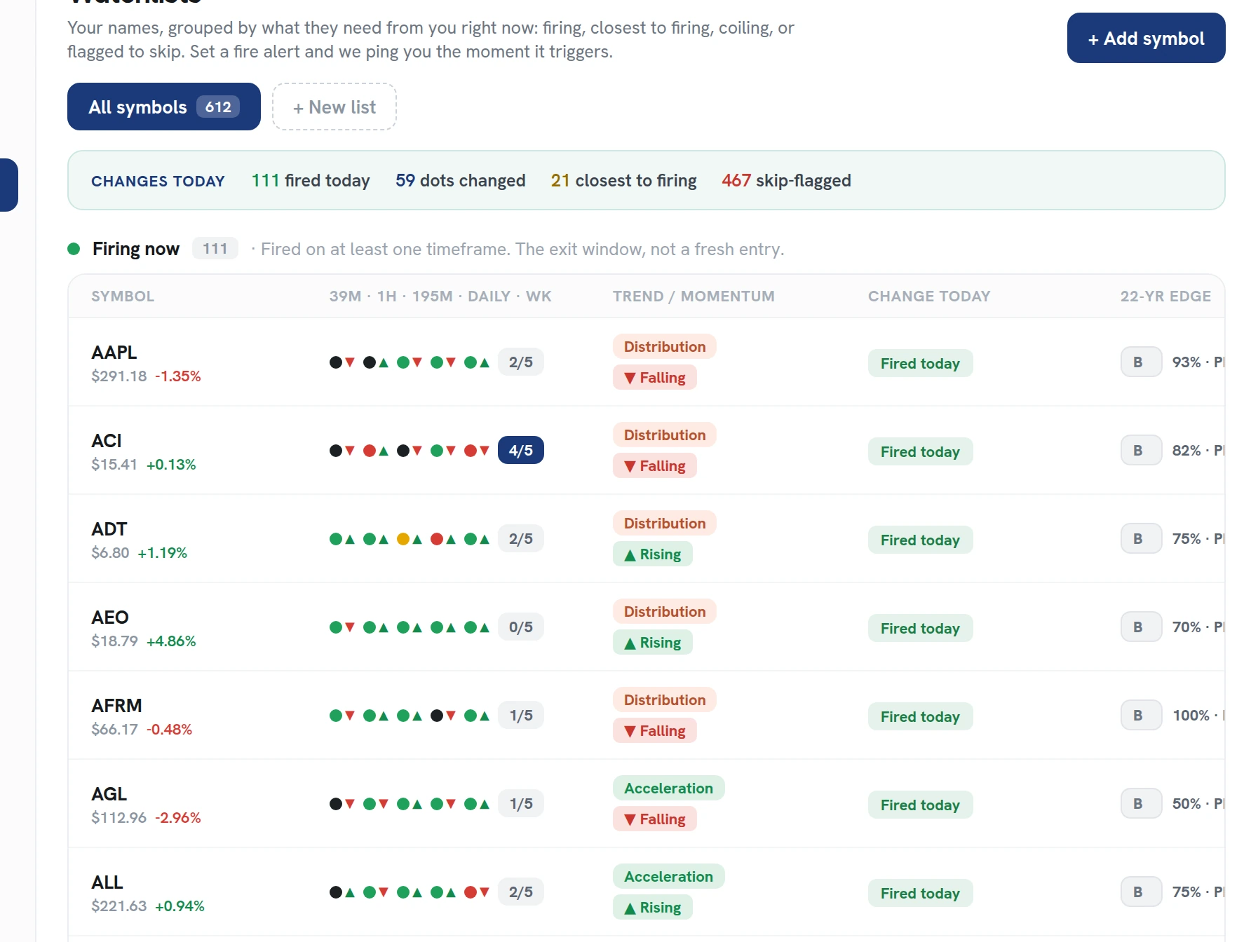
Cut the board down to your trading.
Presets and filters reshape the matrix in one click, so the board always matches how you actually trade.
- Edge filters, like positive-backtest only when you want the short list.
- Timeframe presets, from 5-minute scalping rows to daily and weekly swings.
- Watchlist scoping, so the matrix only shows the names you follow.
Dots are everywhere. Edge is rare.
Any charting platform can draw squeeze dots. The board exists because compression alone carried no edge in our backtests. A positive 22-year record, several timeframes in a squeeze, and a stacked trend did, and the board ranks every cell by them.
Ranked, not just flagged
Every squeeze comes with its three signals, so you compare setups instead of guessing between them.
Multi-timeframe by default
All 12 timeframes side by side per symbol, so you see when compressions stack up across them.
Receipts one click away
The 22-year record on any symbol is right there when you want the context behind the approach.
Read the board, not 600 charts.
Every squeeze across our 600+ stocks and ETFs, ranked by edge, confluence, and trend, on one screen.