Squeeze Dot Colors Explained: Tight, Mid, Loose, Fired
Key takeaways
- Each dot in the Squeeze Matrix has a color (the tier) and a number (the bars in the squeeze).
- The color tells you how tight the compression is: yellow is tightest, black is loosest, green means the squeeze just fired.
- The number tells you how long that squeeze has been building, in bars on that timeframe.
- A tighter tier with a higher bar count is a squeeze that has been winding up for a while and sits close to a release.
On the Squeeze Board, each row carries one dot per timeframe in the Squeeze Matrix column. Two things on that dot matter: its color and the number printed on it. The color is the tier, which is how tight the squeeze is right now. The number is the count of bars that timeframe has spent in the squeeze. Read together, they tell you how compressed a stock is and how long it has been that way.
What do the dot colors mean?
The live legend uses four tiers. Three of them describe an active squeeze at increasing tightness, and the fourth marks the moment the squeeze releases. Here is the full mapping.
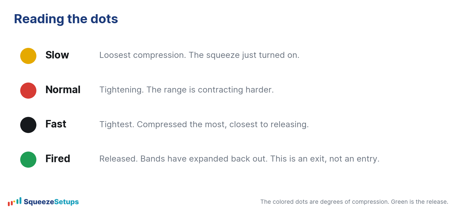
| Color | Tier | What it means |
|---|---|---|
| Yellow | Tight | The tightest active squeeze. This is maximum compression. |
| Red | Mid | A looser squeeze than yellow, tighter than black. |
| Black | Loose | The loosest squeeze still on. Price is compressed, but less than red or yellow. |
| Green | Fired | The squeeze has released. The dot turns green when compression ends and price breaks out of it. |
The order from tightest to loosest is yellow, then red, then black. A yellow dot is a stock that has wound itself as tight as the board tracks. When a squeeze ends, the dot flips to green, which is the fired state. For both the Slingshot Squeeze and the Squeeze Signal, that green fire is the exit, not the entry. You enter on the trigger while the squeeze is still on; you do not chase the green dot.
What does the number on the dot mean?
The color answers “how tight.” The number answers “for how long.” It is a count of bars that timeframe has spent inside the squeeze without releasing. On a daily dot, the number is days in the squeeze. On a 30 minute dot, it is the number of 30 minute bars. A “12” on a daily yellow dot means that stock has been in a tight daily squeeze for twelve trading days.
This is why color and number have to be read together. A high number on a black dot is a long but loose squeeze. A high number on a yellow dot is a long squeeze that has also tightened to its tightest tier: it has been winding up for a while and is now compressed near a release. A tight tier plus a high bar count is the combination worth a second look.
On squeeze versus fired
Yellow, red, and black are all “in a squeeze.” Green is “fired.” The Status column says the same thing in words, showing “in squeeze,” “FIRED,” or a runner chip. The dot color and the Status column agree with each other.
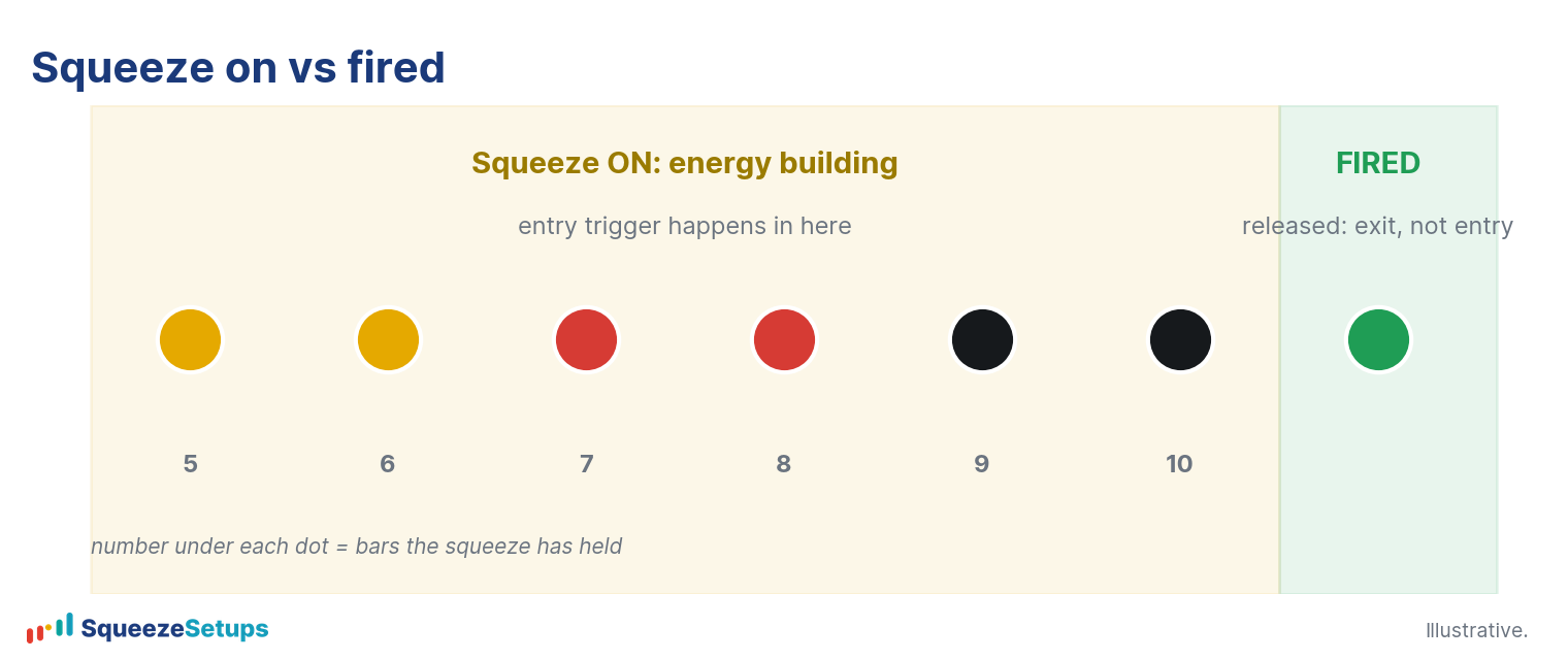
A fired squeeze is a release of compression, not a buy signal on its own. Our backtests are clear that buying a bare squeeze breakout is close to a coin flip. Entering on a bare squeeze won about 53.9% of the time, barely above the 53.7% you get from a random day. The edge does not live in the dot color. It lives in the trigger arrow and the per-symbol 22 year record, which is a separate layer the board scores for you.
How the dots fit with the rest of the row
The Squeeze Matrix dots are one of several columns. The dot tells you the tier and the duration of the squeeze on each timeframe. Other columns then tell you whether anything actionable is happening:
- TFs counts how many shown timeframes are in a squeeze at once (for example 5/5).
- Trigger shows a gold arrow for a Slingshot Squeeze or a cyan arrow for a Squeeze Signal.
- 22-Yr Backtest shows that symbol’s historical win rate, net, and expectancy.
The reading order follows from that. The dots show you compression. A trigger arrow shows you that one of the named setups has fired its entry condition while the squeeze is still on. The backtest column shows you whether that symbol has actually paid off historically. A yellow dot with a long bar count is interesting on its own, but it becomes a candidate only when a trigger and a positive record line up with it.
Reading a dot in practice
Here is an example. Say you see a daily dot that is yellow with a “9” on it. That reads as: this stock has been in a tight daily squeeze (Tight tier) for nine trading days. The compression is at its tightest and it has been building for a while. That is a setup worth opening the symbol drawer for, where you can check the three pillars: whether the trend is stacked, whether multiple timeframes are squeezing together, and whether the 22 year backtest shows a positive edge for this name. The dot got your attention; the drawer tells you whether to act.
Please note: This research is based on historical backtest data. It is NOT a prediction, and it is NOT financial advice.
Related: What is the squeeze?, Days in a squeeze: what the number means, How to read the Squeeze Board, Why are my squeeze dots different colors?
Practice it: the Squeeze stock market game
Read real squeeze charts with the symbol hidden, call long, short or pass, and see what happened. Free, ten new charts every day. Play the Squeeze stock market game