Using Charts: Price, Squeeze Rows, and the Trigger
Goal: Read the Charts screen so you can see price, the squeeze on every timeframe, and exactly where the trigger fired.
You need: A symbol open in Charts (click any row’s Charts button, or open a name from the Symbol drawer or Backtester).
Charts shows you the price action behind a ranked row. The Squeeze Board tells you a symbol has an edge and a live trigger; Charts shows you the candles behind it, which timeframes are compressed, and the candle where the trigger arrow printed. When you open a symbol from the board, it loads on the trigger’s timeframe so the arrow is already in view.
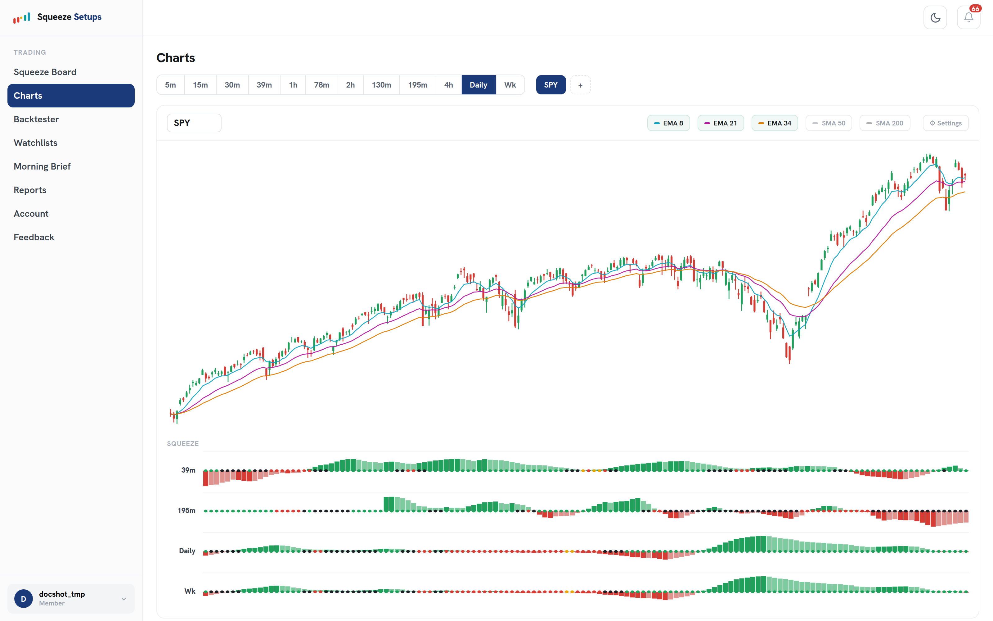
What is on the candle chart?
The top panel is a standard candle chart with two sets of moving averages you can toggle on or off:
- EMAs (fast trend set): EMA 8, EMA 21, and EMA 34. When they line up as 8 above 21 above 34, that is the bullish stack, the third pillar of our methodology and the same stack the board counts in its Stack column.
- SMAs (slower context set): SMA 50 and SMA 200. They give you the longer backdrop so you can tell a fresh trend from an extended one.
Toggle the averages to suit the read. If you only care about the entry trend, leave the EMAs on and the SMAs off. If you want to know whether price is stretched against its longer mean, turn the SMAs on.
How do the timeframe tabs work?
The timeframe tabs switch the whole screen, both the candles and the squeeze rows below, to a single timeframe. Daily is the strongest setup we have validated, with the highest per-trade expectancy, so it is the natural place to start. The intraday tabs let you see the same symbol compressed on shorter clocks.
When you arrive from the board, Charts opens on the trigger’s timeframe, not on whatever you last viewed. A gold arrow on the 4h row of the board opens Charts on 4h; a daily Slingshot opens on daily. That way the arrow you came to see is already under the right candle.
What does the squeeze row under price show?
Below the candles sits one squeeze row per timeframe. Each row tells you whether that timeframe is in a squeeze and, when it is, how tight the compression has gotten. The tiers match the board’s legend exactly:
| Tier | Meaning |
|---|---|
| Yellow | Tight: the tightest compression |
| Red | Mid compression |
| Black | Loose: a squeeze is on, loosely compression |
| Green | Fired: the squeeze has released |
Reading down the rows gives you the same confluence the board scores in its TFs column, but in context with the candles. Several rows compressed at once, with the EMAs stacked above, is the picture behind a high-confluence row. Remember that green is the release, not an entry. For both the Slingshot Squeeze and the Squeeze Signal, you enter on the trigger while the squeeze is still on; the green fire is the exit.
Where is the trigger marked?
The trigger arrow prints under the candle where the setup fired, on that trigger’s timeframe. A gold arrow marks a Slingshot Squeeze; a cyan arrow marks a Squeeze Signal. Because Charts opens on the trigger timeframe, the arrow is already positioned when you land, sitting beneath the exact candle that produced the signal on the board.
This is what makes Charts useful for confirmation. The board says “Slingshot, daily” in a row; Charts shows you the candle, the EMA stack at that moment, and which other timeframes were compressed alongside it. If you switch to a different timeframe tab, the arrow only appears on the timeframe that actually triggered, so you always know which clock the signal belongs to.
A quick way to read the screen
Read the screen top down, in three passes:
- Trend: are the EMAs stacked 8 over 21 over 34?
- Confluence: scan the squeeze rows, how many timeframes are compressed, and how tight (yellow is tightest)?
- Trigger: find the arrow, gold for Slingshot, cyan for Squeeze Signal, under its trigger candle on its timeframe.
That sequence walks the three pillars in order, trend, then confluence, then the trigger, and matches how the board ranked the row in the first place. To see the per-symbol 22-year record behind that trigger, jump to the Backtester from the Symbol drawer.
Squeeze Setups is an educational research tool, not financial advice.
Related: How to read the Squeeze Board, The Symbol drawer, Momentum colors and the turn