How to Know When a Squeeze Is About to Fire
Goal: Read how close a stock is to firing, without pretending you can name the exact bar.
You need: The Squeeze Board open, the dot-tier legend in mind, and a watchlist so you can track the names that are tightening.
The honest answer first: nobody can predict the exact bar a squeeze fires, and we will not pretend otherwise. A squeeze is a state of compression, not a countdown timer. What you can read is proximity: how tight the compression has gotten, how long it has lasted, and whether the highest-quality timeframe has reached the tightest tier. The board surfaces all three, and it can sort names by which are closest to firing. Here is how to read it without false precision.
What does “firing” actually mean?
A squeeze “fires” when the compression releases. On the board that shows up as a green dot (the Fired tier) and a FIRED status. Important: the green fire is the exit on our setups, not the entry. Both the Slingshot Squeeze and the Squeeze Signal are entered while the squeeze is still on, on the trigger arrow. So “about to fire” is the window you care about for entries, and the green dot tells you the window has closed.
This changes what you are looking for. You are not trying to catch the fire. You are trying to find names that are compressed enough, and stacked enough, that the trigger is worth acting on before the release.
Tighter tiers mean closer
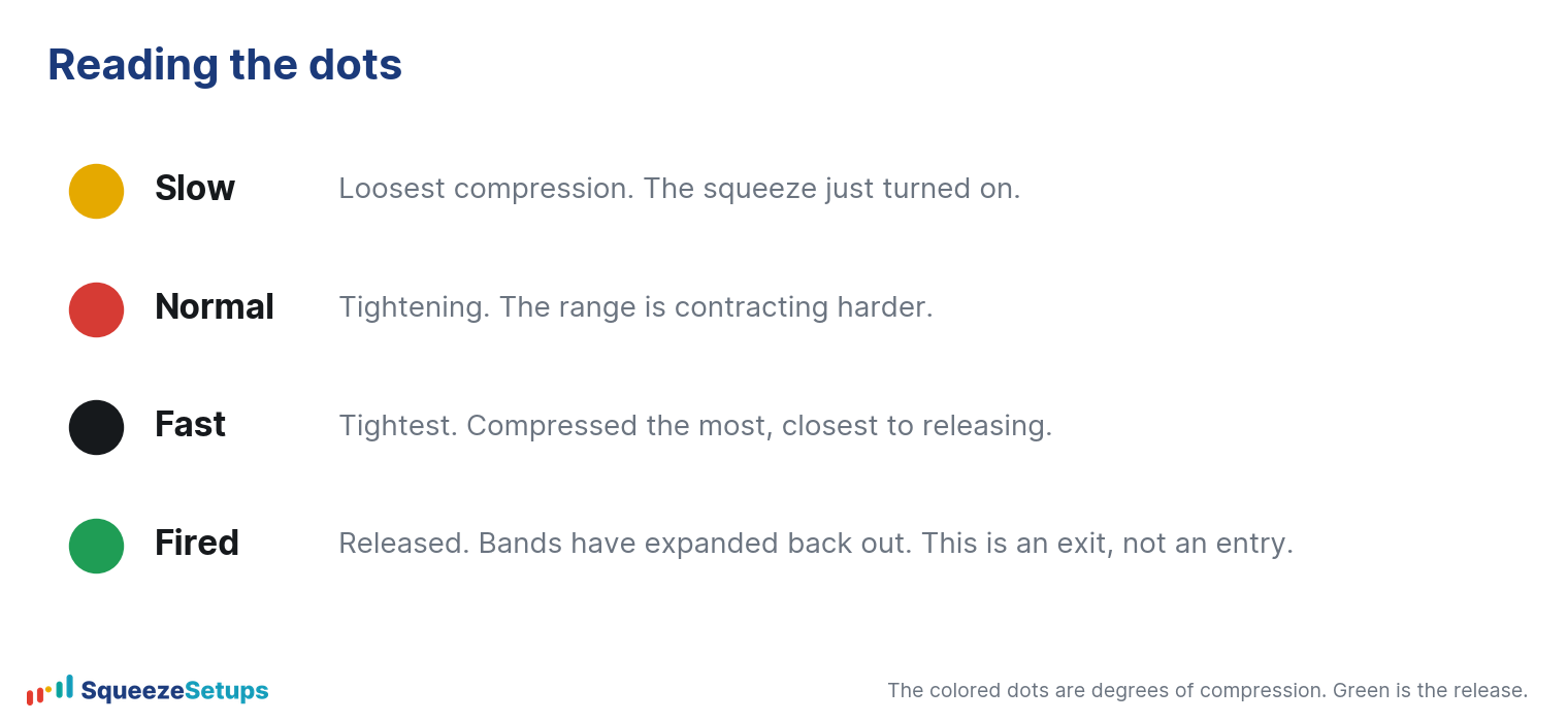
Every dot in the Squeeze Matrix carries a color, and the color is the tier. The live legend reads:
| Dot color | Tier | What it tells you |
|---|---|---|
| Yellow | Tight | Tightest compression, the most wound-up state |
| Red | Mid | Middle compression |
| Black | Loose | A squeeze is on, but loosely compressed |
| Green | Fired | Released; the squeeze is over for that timeframe |
As a rule of thumb, a yellow (Tight) dot is more wound up than a red one, and red is more wound up than black. A name showing yellow on the timeframe you trade is more compressed than one sitting at black. This is a read on tension, not a guarantee of timing: a Tight-tier squeeze can stay Tight for several more bars, or release on the next one. Treat the tier as “how tight,” not “how soon in days.”
Bar count adds duration to the picture
The number printed on each dot is the bar count: how many bars that timeframe has been in the squeeze. Tier tells you how tight; the count tells you how long. A squeeze that has been compressing for many bars has stored more energy, and very long compressions tend to resolve eventually rather than persist forever. We cover what the count means in depth in our days-in-a-squeeze guide, but for proximity the read is simple: a high bar count plus the Tight tier is the most wound-up combination the board shows.
Do not over-fit the count to a forecast. There is no magic number that triggers a fire. It is one more input that, combined with the tier, tells you a name is mature rather than freshly compressed.
The daily reaching Tight is the strongest tell

Not all timeframes carry equal weight. In our backtest, the daily is by a wide margin the strongest timeframe for the Slingshot Squeeze, with expectancy per trade falling off sharply on the shorter ones:
- Daily: +0.93% expectancy per trade
- 4h: +0.56%
- 30m: +0.51%
- 5m: roughly break-even
- 15m: slightly negative
So when the daily dot reaches the Tight tier on a stacked name, that is the read that matters most. A Tight 5m dot is noise compared to a Tight daily dot.
The same row shows the TFs column, for example 5/5: how many of the shown timeframes are in a squeeze at once. Multi-timeframe confluence is one of our three pillars, so a daily at the Tight tier with several other timeframes also compressed is the highest-conviction “closer to firing” state the board can show. Pair that with the 22-Yr Backtest columns on the right (n trades, Win %, Net %, Exp) so you are only leaning on names that have a positive per-symbol record, not just a tight dot.
Let the board find the closest names for you
You do not have to scan every row by eye. A few views do the proximity work:
- Filter row: set the tier filter to Tight and add a minimum expectancy, and you isolate the most-compressed names that also have an edge.
- Multi-TF Squeeze tab: shows names with confluence across timeframes, which biases toward mature, wound-up setups.
- Watchlists: your saved names are grouped by what they need now, including a “closest to firing” group, plus a “Changes today” view that flags dots that changed and names that fired today.
- Morning Brief: the dated digest labels each name’s state as “squeeze building,” “near mean,” or “extended,” so you can see at a glance which compressions are still early versus stretched.
Click any row to open the Symbol drawer, which scores the three pillars (trend stacked, timeframe confluence, positive backtest) in plain language and shows the full 22-year record. That verdict is the sanity check before you treat a tight dot as actionable.
What this does not give you
It does not give you a bar-by-bar prediction, and you should be skeptical of anything that claims to. A yellow daily dot with a high bar count and confluence is a name worth watching closely; it is not a promise that the fire comes tomorrow. The point of reading proximity is to be ready with the trigger and the backtest before the window closes, not to time the release to the candle. One trade in three still lost even on our best setups, and that is with no foreknowledge of timing at all.
Squeeze Setups is an educational research tool, not financial advice.
Related: Squeeze dot colors explained, Days in a squeeze: what the bar count means, How to read the Squeeze Board