Days in a Squeeze: Counting Bars and Why It Matters
Key takeaways
- The number printed on each dot in the Squeeze Matrix is the bar count: how many bars that timeframe has stayed in a squeeze.
- Longer compression tends to store more energy, so a bigger move often follows when the squeeze finally fires.
- Bar count is most useful when you read it alongside the dot tier (yellow Tight to black Loose) and timeframe confluence, not on its own.
- A bar count is context, not a trigger. The edge in our backtest comes from the named setups firing inside a stacked uptrend, not from the count itself.
On the Squeeze Board, every dot in the Squeeze Matrix carries a small number. That number is the bar count: how many bars in a row that timeframe has been in a squeeze. A “7” on the daily dot means price has been compressed for seven daily bars and counting. The count is a measure of how long volatility has been pinned down before it releases.
What does the number on the dot mean?
Each row on the board is one stock, and the Squeeze Matrix is one dot per timeframe. The dot’s color is the tier (how tight the squeeze is), the small triangle is momentum direction, and the number is the bar count. So a single dot tells you three things at a glance: how tight, which way momentum points, and how long it has held.
The count resets to zero the moment a timeframe leaves the squeeze. While the squeeze is on, the number climbs by one each new bar. When the squeeze fires, the dot turns green and the count stops mattering, because the stored energy is now being spent in the move.
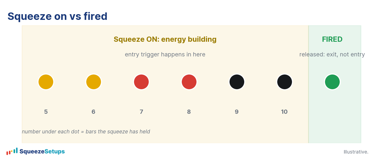
Why does duration matter?
The intuition is simple: the longer a market stays compressed, the more pent-up the eventual expansion tends to be. A squeeze is a period where range contracts and price grinds sideways. The longer that goes on, the more orders pile up on both sides, and the sharper the move when one side gives way. A two-bar squeeze that fires usually produces a small move. A twenty-bar squeeze that fires after weeks of tightening tends to produce a larger one.
Duration is not a standalone signal, though, and it is easy to over-read a big number. In our 22-year backtest across 614 stocks, counting bars or dots barely moved the needle against a random day at 53.7%:
- A bare squeeze entry won about 53.9% of the time.
- Wait-for-five-dots was about 54.1%.
- Buying the first green dot was about 54.8%.
The bar count tells you that pressure is building. It does not tell you the move will be up, or that you have an edge. That comes from the setups.
How bar count works with the tier
Duration pairs naturally with the dot tier. The tiers describe how tight the squeeze is right now, from tightest to loosest:
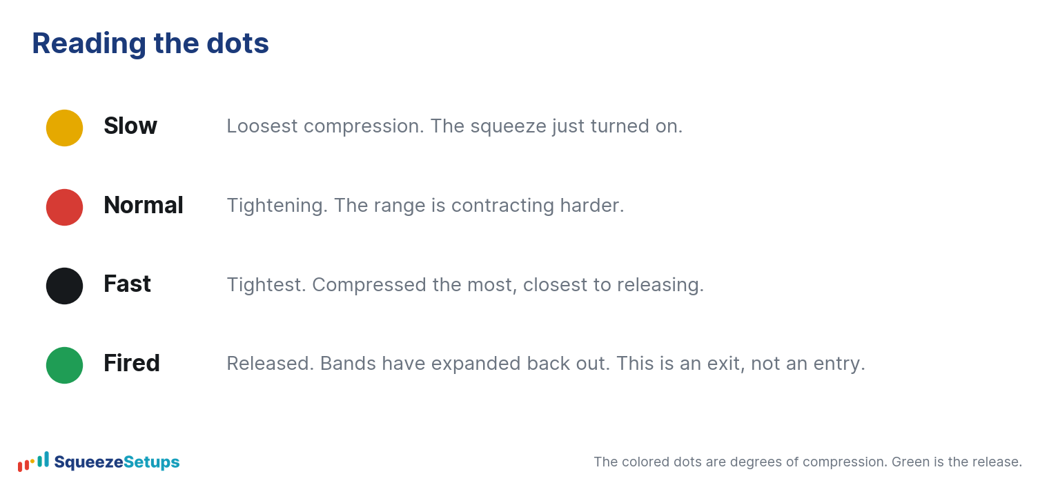
A high bar count on a yellow (Tight) dot is the most loaded combination the board shows: a squeeze that has held for a long time and has now wound to its tightest tier. Compare that to a high count on a black (Loose) dot, which has been compressed for a while but is still relatively loose. The first is a market compressing hard after a long buildup; the second is just a long, lazy quiet. Same number, different meaning, because the tier changes the reading.
| Bar count | Tier | What it suggests |
|---|---|---|
| Low (a few bars) | Black / Loose | Early, loose compression. Little stored energy yet. |
| High (many bars) | Black / Loose | Long but loose. Quiet, not necessarily loaded. |
| Low | Yellow / Tight | Tight, but young. Watch it build. |
| High | Yellow / Tight | Long buildup at the tightest tier. Most loaded reading on the board. |
Where the count fits with the three pillars
The board ranks rows by three pillars: backtest edge (the per-symbol 22-year record), timeframe confluence (how many shown timeframes are in a squeeze), and trend (the EMA 8>21>34 stack). The bar count is not a fourth pillar. It is supporting context that helps you read the squeeze itself.
The TFs column tells you breadth: a 5/5 means every shown timeframe is compressed at once. The bar count on each dot tells you depth in time: how long each of those timeframes has held. Confluence plus duration plus a tight tier describes a market that is compressed across the board, has been for a while, and is wound tight. That is a rich setup, but it is still only a setup until a trigger appears.
The actual edge lives in the named triggers firing inside that context. On the daily, our backtest shows:
- Slingshot Squeeze: 69.1% wins and +0.93% average per trade across 5,852 trades, era-stable from 66.8% to 70.9%.
- Squeeze Signal continuation: 67.4% wins and +0.71% per trade.
In both cases you enter on the trigger while the squeeze is still on, with Edge Signal confirmation, and the green fire is the exit, not the entry. A long, tight squeeze is the kind of context those triggers tend to fire in, but the number on the dot is what you read, not what you trade.
Reading the count on the board, step by step
To put it together on a live row: look at the Squeeze Matrix and scan the dot colors first to find the tightest tiers, then read the numbers on those dots for how long each has held, then check the TFs column for breadth and the triangle for momentum direction. A row with several yellow dots carrying high counts, a strong TFs reading, and a trigger arrow in the Trigger column is a market that has been compressing hard, across timeframes, for a while, and has just given a signal. Click the row to open the symbol drawer and confirm the three pillars and the 22-year record before you act.
One caveat: a long squeeze does not promise the direction. About 46% of long signals in our data never even pulled back a full ATR, and those runners won about 92%, but the rest still had work to do, and one trade in three still lost. A big bar count raises the stakes of the eventual move. It does not pick the winner.
Please note: This research is based on historical backtest data. It is NOT a prediction, and it is NOT financial advice.
Related: Squeeze dot colors explained, What is the squeeze?, How to read the Squeeze Board