Do Our Squeeze Dots Match ThinkorSwim? An Honest Accuracy Note
Key takeaways
- Our squeeze dots use the same standard math as ThinkorSwim: a Bollinger Band reading sitting inside a Keltner Channel. When that is true, the squeeze is on.
- Because the rule is identical, the on/off state of the squeeze matches ThinkorSwim closely on the same symbol and timeframe.
- Small differences can still show up, and they almost always trace back to data source, the exact bar being read, or rounding, not to a different formula.
- Our dot tiers and the trigger arrows are our own layer on top of that shared squeeze math, so those will look different by design.
Yes, for the most part. We use the same standard squeeze definition that ThinkorSwim popularized: a stock is in a squeeze when its Bollinger Bands have contracted to sit inside its Keltner Channel.
That single on/off condition is the foundation of both, so on the same symbol and the same timeframe, our dots turn on and off in step with what you see on a ThinkorSwim chart almost all of the time.
Below we explain exactly where the two agree, where they can drift by a bar, and what is intentionally different.
What is actually being compared?
The squeeze itself is one binary fact: are the Bollinger Bands inside the Keltner Channel right now, or not? That math is public and standard.
We did not reinvent it. So the question “do your dots match ThinkorSwim” really means “does your on/off squeeze state agree with theirs,” and on that narrow, well-defined question the answer is yes.
Everything else you see on the Squeeze Board, the dot tier colors, the bars-in-squeeze count, the momentum triangle, and the trigger arrows, is a layer we built on top of that shared squeeze state. Those are our design choices, so they will not have a one-to-one match on a stock ThinkorSwim chart.
That is expected, not an error.
How our dot tiers read on the board
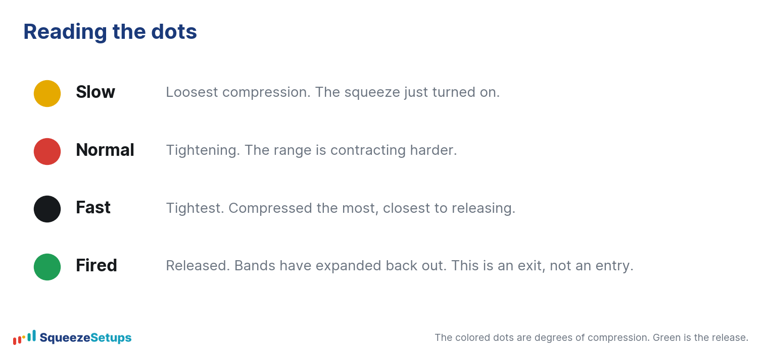
On our board, each timeframe gets one dot, and the dot’s color is its tier. The live legend reads:
- Yellow is Slow.
- Red is Normal.
- Black is Fast (the tightest).
- Green is Fired.
The number printed on the dot is how many bars the squeeze has been on, and a small triangle shows momentum direction. ThinkorSwim’s default squeeze indicator does not carry tiers in the same words, so this naming is ours.
The underlying “is there a squeeze” answer behind every non-green dot is still the same Bollinger-inside-Keltner condition.
Where can the two differ, and why?
When a difference shows up, it is small, and it comes from one of three ordinary places rather than from a different formula:
| Source of difference | What it looks like |
|---|---|
| Data source | Our prices and ThinkorSwim’s feed can post slightly different highs, lows, or closes on the same bar, which can flip a borderline squeeze on one side. |
| Which bar is being read | An intraday or just-closed bar can be in flux. We read a settled bar; a live chart may still be updating, so the state can lag or lead by one bar. |
| Rounding | When the Bollinger Band and the Keltner Channel are nearly touching, tiny rounding in the math can decide on versus off for that one bar. |
None of these change the rule. They change a single borderline reading at the moment the bands and channel are practically on top of each other. A bar or two later, the two agree again.
What you see on a chart
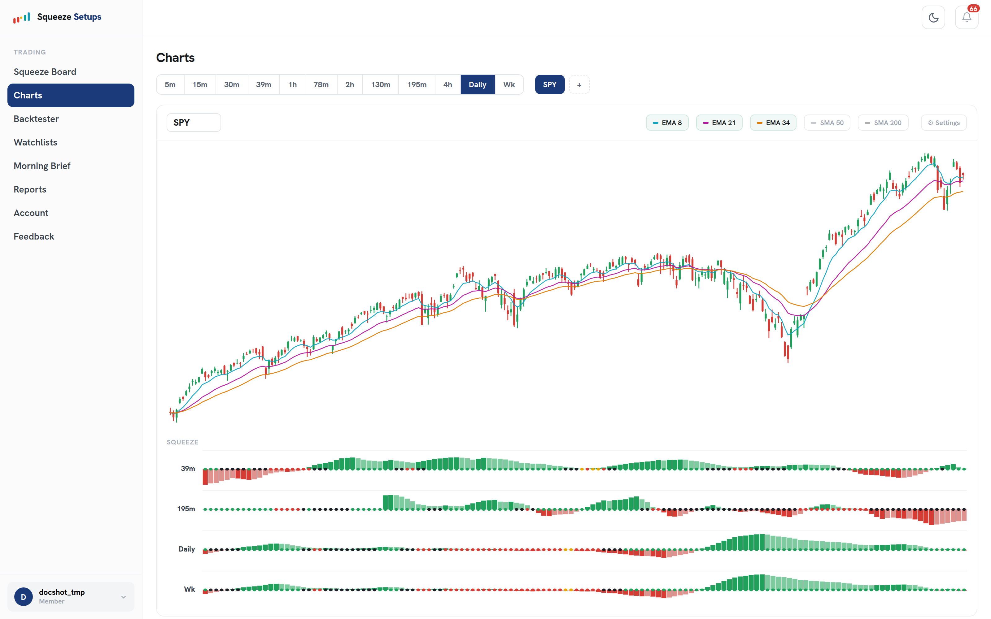
Our Charts page is built to make this easy to check. You get a candle chart with EMA 8/21/34 and SMA 50/200 toggles, timeframe tabs, and a squeeze row under price for each timeframe.
If you put the same symbol and timeframe side by side with a ThinkorSwim chart, the run of squeeze bars should line up.
The one thing you will not find on a plain ThinkorSwim chart is our trigger arrow marked under the trigger candle, because the triggers are our own setups, not part of the standard squeeze.
The triggers are deliberately not a ThinkorSwim feature
A gold arrow on our board is a Slingshot Squeeze and a cyan arrow is a Squeeze Signal. Both are entries we define on top of the squeeze: enter while the squeeze is still on, in a stacked uptrend, with our Edge Signal confirmation, and treat the green fire as the exit, not the entry.
These are the parts our 22-year, per-symbol backtest is built around.
They will not appear on a stock ThinkorSwim chart because they are not the standard squeeze, they are our research layer. So when our trigger fires and ThinkorSwim just shows a squeeze dot, the two are not in conflict; they are answering different questions.
Why we are telling you this
Here is the summary: the squeeze on/off state matches ThinkorSwim closely because we use the same standard math, occasional one-bar borderline differences come from data and rounding, and our tiers, dots, and trigger arrows are an additional layer we built and backtested ourselves.
If you ever see a mismatch that is more than a borderline bar, it is worth a closer look at the data feed and the exact bar, and you can check it against the data feed yourself.
Please note: This research is based on historical backtest data. It is NOT a prediction, and it is NOT financial advice.
Related: Squeeze dot colors explained, Best squeeze settings, What is the squeeze?